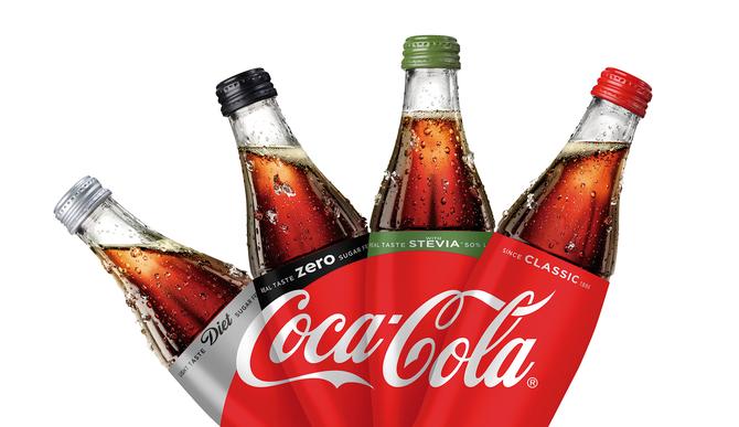
Coca-Cola products and packaging across the range will be unified on shelves with one design from this month following the FMCG company’s decision to bring its iconic ‘red disc’ to all product and marketing globally.
The new visual look marks the single biggest change to the Coke family of products in its 130-year history and launches officially in Australia on 6 February. The range will feature the ‘rising sun’ red disc plus a splash of their signature colour, as well as each sub-brand’s distinct tagline. Diet Coke, for example, features the ‘light taste, sugar free’, Coke Zero features ‘real taste, sugar free’ and Classic retains ‘since 1886’.
The new physical products and packaging will be supported by widespread above-the-line activity and shopping material that will see all products featured within the one overarching marketing campaign.
Speaking at an event in Sydney to mark the launch of the new design, Coca-Cola Company vice-president of design, James Sommerville, said he and the design team had tapped into the historic and iconic designs of yesteryear to come up with the modern product design. In particular, he referenced the introduction of Coke’s red disc in hand-painted store advertising in the 1930s, followed by the introduction of the red disc into marketing by Archie Lee at D’Arcy in the 1940s, as key to providing the “design system” Coke needs to unify the brand for the future.
One of the challenges Coca-Cola has faced over the years as its product range expanded into Diet Coke, Coke Zero and Coke with Stevia, is that it’s drifted away from the iconic ‘Coca-Cola red’ of the original product, Sommerville said.
The unified look and red disc iconography will provide a “billboard effect” across the shelves of supermarkets and stockists, Sommerville said, reclaiming the iconic red colour and ensuring future product releases align with the rest of the brand portfolio.
The “north star” for the masterbrand was a question posed by Coke’s global chairman and CEO, Muhtar Kent: What will the beverage aisle look like in 2025?
“He was provoking the conversation, not giving the solution. But that got me thinking: We have all these different colours out there, and we’ve done an amazing job of building these sub-brands – we’re very proud of them, and they’ve been very successful. But at the same time, what would that look like by 2025, if we continue to be successful? What colour will it be as we launch a product with coffee, ginger or some other nutrient?” Sommerville asked.
“Ultimately, what we needed to create was this longer-term strategy. What we have done in creating these successful sub-brands over the last 15 or 20 years is take away some of this equity, pulled it away from the core and developed these families.
“What we’ve about to do is invite everyone back to the core – everyone who fell in love with the brand in the beginning still has their choices, but ultimately they’re coming back into the one brand strategy for us.”
Coca-Cola first announced its ambitious One Brand strategy last year, a move aimed at uniting the ever-expanding product range under one umbrella. Having originally come up with the idea of a masterbrand strategy, Sommerville said live in-market testing saw the group test two main looks: Monocolour and split red.
“Split red wasn’t the best looking but strategically the right thing, so we knew we had to build our story and thought process around how we take the essence of split red, and a red base, and improve the design language,” he continued. “That narrowed the field.
“Once the results came back, it enabled us to close in on what to do, and what to address. With the right testing and long-term strategy, things become less subjective. It becomes more about whether it works and does it uphold the value of the brand. That’s how you come up with the right solution.”
Five agencies globally worked on the creative design before the team finally came to the realisation that the red disc was the element needed to unify the visual look. The red disc will now be used in varying sizes and in different ways across product, packaging, marketing, sponsor materials and more to reflect the maturity of the geography in terms of consumption.
Another turning point internally was the appointment of Coca-Cola global CMO, Marcos de Quinto, two years ago, who Somerville described as a strategic marketer with ambitions to bring marketing efforts back to the core product.
“As Marcos said several times, don’t look at this for design, look at this for the strategic intent,” he said.
Coca-Cola South Pacific marketing director, Lisa Winn, added leadership was vital in getting the brand transformation over the line. Heavy above-the-line activity will be launched locally, supported by the existing ‘taste the feeling’ campaign, she said.
“Marcos is a very strategic marketer and quite bold in vision,” she told CMO. “Once you have strong, clear vision for the future, strong leadership and the strategy is right, that [nervousness and hesitancy] becomes subjective noise. Then you can move with speed, and with a sense of purposefulness. Also with iteration – learning, testing and evolving things. It’s how we’ve been able to do it so quickly.”
Aligning design with content and digital
Another major operational change now ensuring consistency and cross-functional collaboration around visual and brand identity is that there are no “hard lines” between the design, digital and content teams. Sommerville said.
“As a triage between design, digital and content, we all have our respective responsibilities to deliver,” he said. “When I joined Coke, those hard lines were there – we’d meet but there’d be no kind of team tagging. It was more individual teams.
“With Marcos arriving, we saw it as an opportunity to engage as a design team with the other two teams in a different way. The content leader then invited the design team to be part of the shooting of the out-of-home material, which we’d normally not have a sniff at. All of a sudden, there is this cross-pollinating of ideas, conversations and ultimately the work. We believe that is the way forward.
“As an organisation, we’re really trying to blur that because it’s just more productive. There’s a broader understanding of the needs of the business as a result.”
Sommerville called on agencies to embrace new ways of working with clients as well.
“Rather than disappearing for a month, and coming back with a PDF that’s very linear, come back in two days and send us your working files, and we’ll noodle around in that and send them back. Some more progressive agencies – smaller quite often – are very open to that,” he said.
Sommerville said his team and agency partners also use Pinterest as a way of gathering ideas, or what he called a “pin point of view”.
“We don’t look for a pitch or solution, but a point of view on the brand,” he said. “We’re really pushing our agencies to be less traditional in approach.”
Follow CMO on Twitter: @CMOAustralia, take part in the CMO conversation on LinkedIn: CMO ANZ, join us on Facebook: https://www.facebook.com/CMOAustralia, or check us out on Google+:google.com/+CmoAu