Stories inspire.
Data connects.
The world’s most influential IT buyers engage, discover, and decide with Foundry. We help tech marketers connect with and address the full buying team.
Marketing for the new B2B buyer.
The complex needs of today’s buyer require a new approach to marketing—one that humanizes and personalizes the B2B experience by aligning who buyers are, how they behave, and what they value.
Marketing at its best connects intent data and storytelling to deliver experiences that resonate with buyers’ unique needs, cultivate trust, and build strong business-to-buyer relationships.
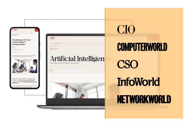
Our editorial brands
Our award-winning brands have been at the forefront of global tech innovation for more than 50 years, acting as a partner in the milestones that drive the industry forward. As tech buyers’ trusted source for trends, research, and decision-making, our brands are the core of everything we do.
28M+
Monthly visitors
learning, researching, and engaging across our editorial properties each month
800+
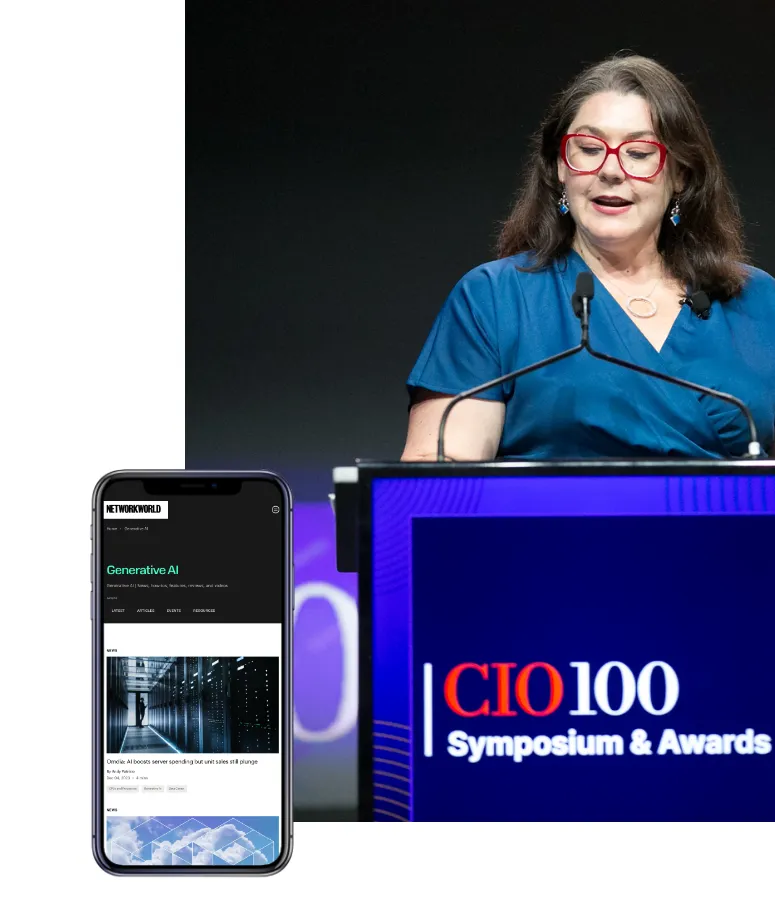
Industry-leading events
bringing together IT decision makers around the world each year
96%
Visitors take action
towards purchasing after engaging with content across our award-winning editorial sites
What's new at Foundry
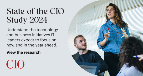
Foundry’s 23rd annual State of the CIO research details how the role of the CIO continues to evolve and elevate in today’s business climate and defines the CIO agenda for 2024.
View the research
With an average of 25 stakeholders to impress, months-long buying journeys, and competing for mindshare on noisy channels, B2B marketers need to leverage the power of story now more than ever.
Read the blog
Join Rick Currier in his series, “On the Road”, in a captivating discussion with Melissa Nacerino, VP Global Partner Marketing at Zscaler, as she unveils her unique journey from politics to partner marketing.
Watch the interviewWho we are
We are a team made up of dedicated, talented, and passionate people across the globe. We’re passionate about the fact that technology can be a force for good. Leveraged wisely, it can have a hugely positive influence—and to this end we’re driving progress in a number of areas, including diversity and inclusion, tech accessibility, and women in leadership.
About us
At Foundry,* we’ve been at the forefront of the technology sphere since 1964. We’re proud to be an authority in the tech industry, reaching audiences all over the world.
We’re part of a vibrant community of technology buyers, and when we interact with them, we learn about them. Thanks to intent data, we understand our audiences like no one else – and as a result, we’re able to create the media and software solutions that help technology vendors guide decisions.